Homepage Widget
Introduction
As a product manager at MiMedia, I strive to improve our app by making it more user friendly and including tools that our customers find helpful. Since we are installed on Android phones, our main competitor is Google Photos. In order to stand out, we offer free cloud storage and more opportunities to customize MiDrives (photo albums) and the user’s device through our Live Wallpaper feature.
Problem
We are struggling to keep users engaged once they open our app.
Competitive Analysis
In order to understand how competitors keep their users engaged, I searched through our competitive research database and downloaded the newest versions of our main competitors’ apps – Google Photos, Amazon Photos, and Apple Photos. I wanted to record any popups or informational notes that alerted users to exciting new features in order to discern how companies advertised themselves within their own app.
Through this process, I discovered that many apps have an informational sign or popup on their Homepage or one that appears soon after the user opens the app, that informs the user about any new features they haven’t explored yet. Some apps also use push notifications to highlight new features and get users back into their app. These popups often have friendly language or visuals to make the user feel more comfortable.
Design Process
When designing a feature to improve user engagement, I needed to answer the following questions: what form should this solution take, what features should it advertise, and where and how should it be incorporated into the app?
1. Form it Should Take
First, I thought about what type of feature I wanted to build. I decided on a “widget” that was included on a page, but could be dismissed. During my competitive analysis, I noticed that many of our competitors had a similar feature, and I liked that it captured the user’s attention but wasn’t disruptive to the user experience.
2. Features Advertised
With this widget, we wanted to get users excited about our features, and help them to see what benefits we offer like 5GB of free cloud storage. Since signing in unlocks all of our cloud features, I thought that should be what we promote first, so that in the future we could bring attention to our cloud features.
After deciding to promote Sign in, I continued to brainstorm features that could be advertised to envision what a second widget could look like. We decided the second widget should advertise our integration of the user’s photos with the device’s wallpaper. My hope with this widget was that by using our app to set their device’s wallpaper, users will begin to regularly think of our app even if they do not open it consistently.
3. Where and How
Step 1: Where
From my competitive research, I determined that the ideal location for the widget was on the Homepage, since it is the page the user is placed on when they open the app and most users wouldn’t see the widget if it was on a different page.
Step 2: How – Requirements
When thinking through how the widget would function on the page, there was a lot to consider:
- How would it be dismissed?
- Would it behave differently based on whether or not the user was signed in?
- Where would it sit on the page?
- Would it be placed on top of the current content on the page or would the content be shifted down?
- Would the widget stay in its place when the user scrolled or would it scroll with the page?
- How would this widget look on phones with different dimensions?
In order to answer these questions, I created a Product Requirement Document (PRD), noting all potential requirements and then met with our team.
Step 3: How – Visual Design
After the team meeting and revising my PRD to incorporate feedback, I created a mockup to show how the widget would look on the Homepage. As a more visual person, I have found that creating a mockup helps fill in gaps in the PRD.
Step 4: How – Revision
After completing the first version of the mockup, I met with our developer and QA engineer to explain how the feature should work. We went through the mockup and the PRD so that our developer could ask questions about the design and share technical concerns and the QA engineer would know how to test the feature once it was developed.
As a product manager, I sometimes prioritize design and business relevance, over small technical details. Our developer, on the other hand, first sees the technical details and thinks through ways that this widget could impact the existing design and what decisions need to be made before implementation.
After this meeting, I worked on a final revision of both the PRD and the mockup, created a ticket in Jira with all the relevant information for our developer and let our developer know he could start working.
Solution
Overview
Two widgets were created and implemented: the Sign In Widget and the Wallpaper Widget.
PRD Summary
- Resides on the Homepage
- Moves up with content, does not stay at the top of the screen if the user scrolls
- Can be easily dismissed by an X in the top right corner
- Later changed to a “Not now” below the “Sign in” button
- If user signs in or sets their wallpaper, the widget should disappear automatically
- Sign In Widget only appears when the user is not signed in
- Wallpaper Widget is only present when the user’s wallpaper is not set (and Sign In Widget is dismissed)
- If the Sign In Widget disappears because user signs in or dismisses it, the Wallpaper Widget should appear in its place unless users wallpaper is already set
- “Sign in” button on the Sign In Widget should begin the sign in flow
- “Set it up” button on the Wallpaper Widget should begin the wallpaper setting flow
Visual Design
I wanted to make the Sign In Widget design simple and in keeping with the apps overall design. For inspiration, I looked to our app’s Discover page that displays shortcuts to the This Day, Live Wallpaper, and Surprise Me features.

MiMedia app – Discover screen 1 (This Day)

MiMedia app – Discover screen 2 (Live Wallpaper)
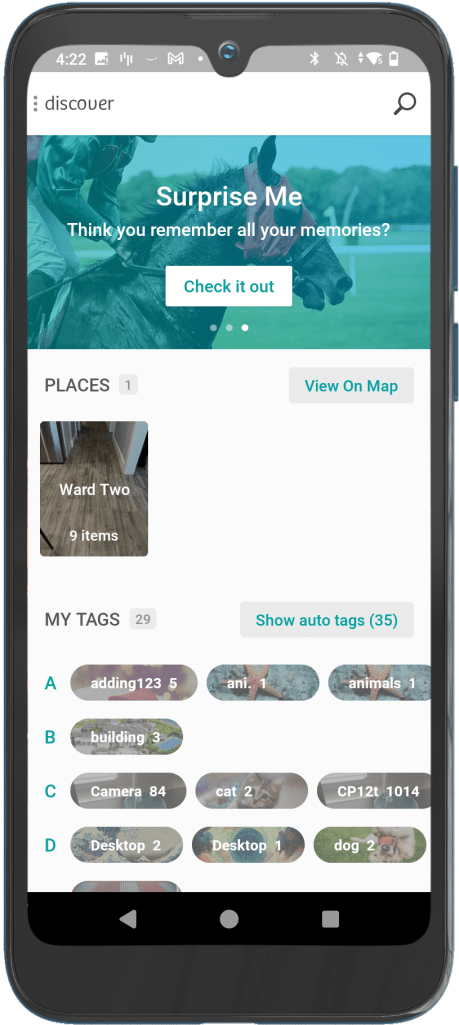
MiMedia app – Discover screen 3 (Surprise Me)
After doing a competitive analysis that showed that popups in other apps were clean and had only text and maybe an icon, I went to the drawing board and came up with this design:
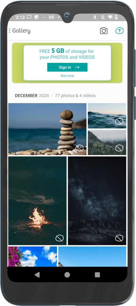
MiMedia app – Homepage Widget version 1

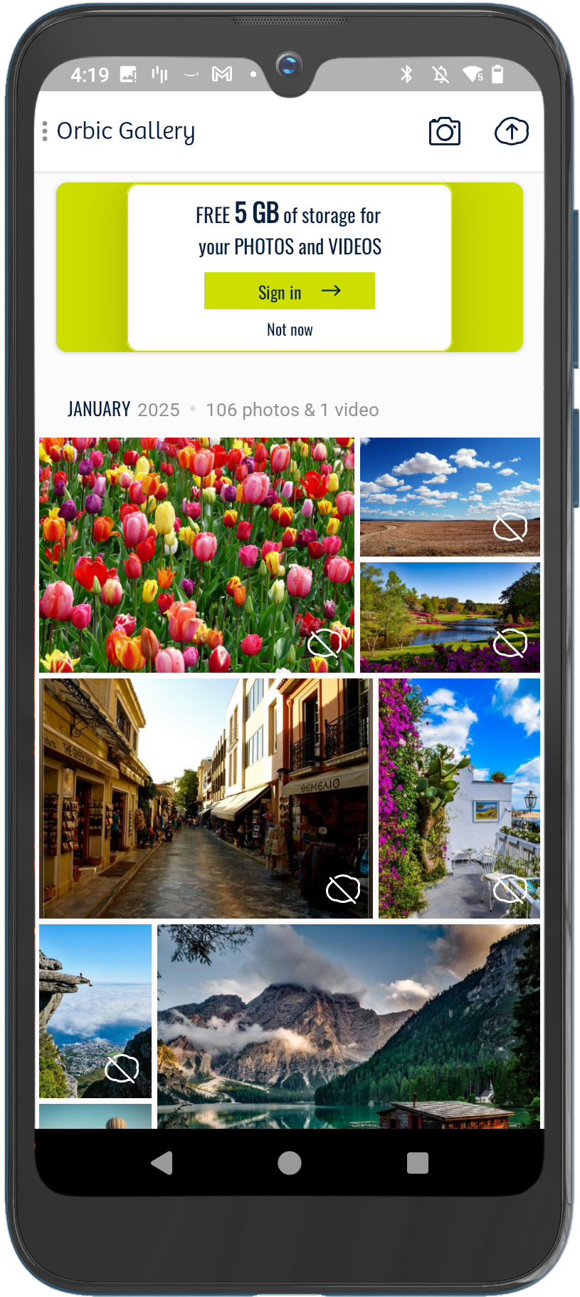
Partner app – Homepage Widget version 1
“Partner app – Homepage Widget version 1” is an example of how I altered the widget design for a partner app that has different branding from MiMedia. In order to keep our designs scalable and easily adjustable for all partners, I only changed the font and colors.
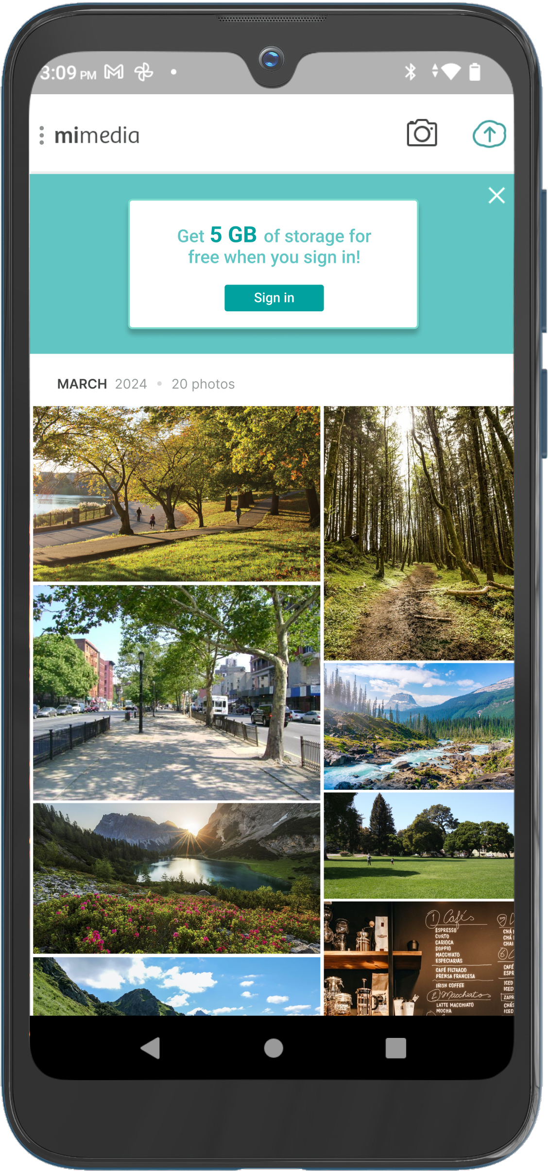
A second version of the Sign In Widget was published to devices a month later. This version was created in response to feedback requesting that the widget design distinguish itself from the app background to give the impression that it is a non-permanent feature. This design emphasizes that the Homepage can revert to the design before the widget was introduced that users are more comfortable with. We also removed the X in the top right corner and replaced it with the “Not now” button to make the design more consistent with other popups in the app.

MiMedia app – Homepage Widget version 2
Partner app – Homepage Widget version 2
We continued this project with the release of the Wallpaper Widget. Since it is advertising the Live Wallpaper feature, which the Discover page already advertises, I wanted to keep the app consistent and use essentially the same design as the one we had on the Discover page.
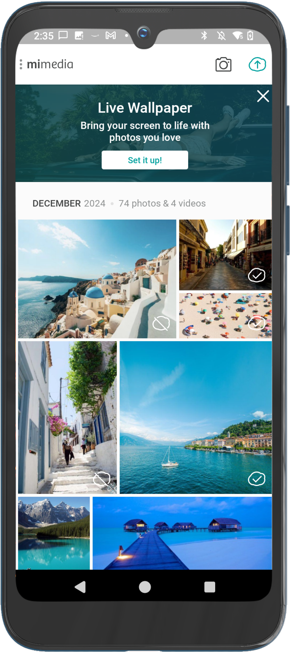
MiMedia app – Wallpaper Widget
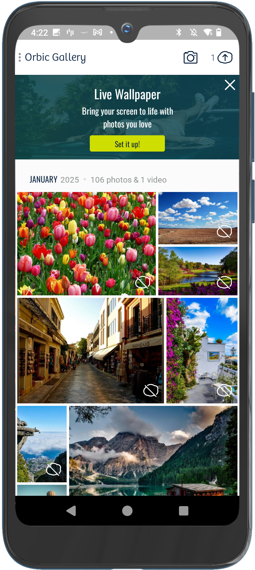
Partner app – Wallpaper Widget
 Nina Houston